

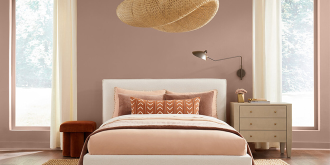
Sherwin-Williams has announced Redend Point (SW 9081) as its 2023 Color of the Year. A calming blush-beige, this color inspires expanded horizons and eye-opening discoveries and brings warmth and intrigue into the home.
“Redend Point was inspired by the idea of finding beauty beyond ourselves. It is a heartening hue that invites compassion and connection into any space,” says Sue Wadden, director of color marketing at Sherwin-Williams. “The color is a natural choice for those looking for a warm and joyful neutral in both interiors and exteriors. Redend Point is a beautiful color, and I can’t wait to see how consumers play with it and style their spaces.”
Redend Point embodies the idea of a destination worth moving toward, igniting the spirit of discovery and inspiring deeper connections with others throughout the world. In exploring beauty beyond ourselves, the hue provides a grounding reminder to stay curious and empathetic toward ourselves and our communities.
As neutrals continue to warm up, Wadden expects this blush-beige to be a versatile shade seen across residential and commercial spaces in the years to come.
Building on the new beginnings emphasized by 2022 Color of the Year Evergreen Fog SW 9130, the soulful Redend Point breathes life into every part of the home, from the living room to the bedroom.
“Redend Point’s subtle pink undertones make it easy to incorporate into any space. It delivers an enveloping warmth that instantly makes you feel at home,” Wadden says. “Build on its earthiness by utilizing the hue alongside natural-looking textiles and wood accents or create a desert oasis by layering terracotta shades and clay materials.”
The intriguing hue is part of the Nexus palette in the Sherwin-Williams 2023 Colormix® Forecast, which celebrates restorative energy, well-being and kindness. Wadden recommends pairing the hue with grounding neutrals like Urbane Bronze SW 7048, Pure White SW 7005, Cool Beige SW 9086 and Foothills SW 7514, or tonal clays such as Hushed Auburn SW 9080, Toile Red SW 0006, Carnelian SW 7580 and Malted Milk SW 6057.
The neutral’s versatility makes it a calming choice in a variety of commercial and communal settings.
“There is no commercial setting more central to the concept of beauty beyond ourselves than community gathering spaces,” Wadden says. “Whether that is a restaurant, office or multifamily building, this hue adds the feeling of restoration that encourages connection to both ourselves and others.”
The earthy tone brings the outdoors into multiuse areas to ground spaces for rest and relaxation, like lounges and community rooms, and draws patrons into lobbies and welcome areas with its subtle warmth.
Discover more 2023 Colors of the Year here.

